Kansas City Public Library
Spotlighting the vibrancy of today’s public library
challenge
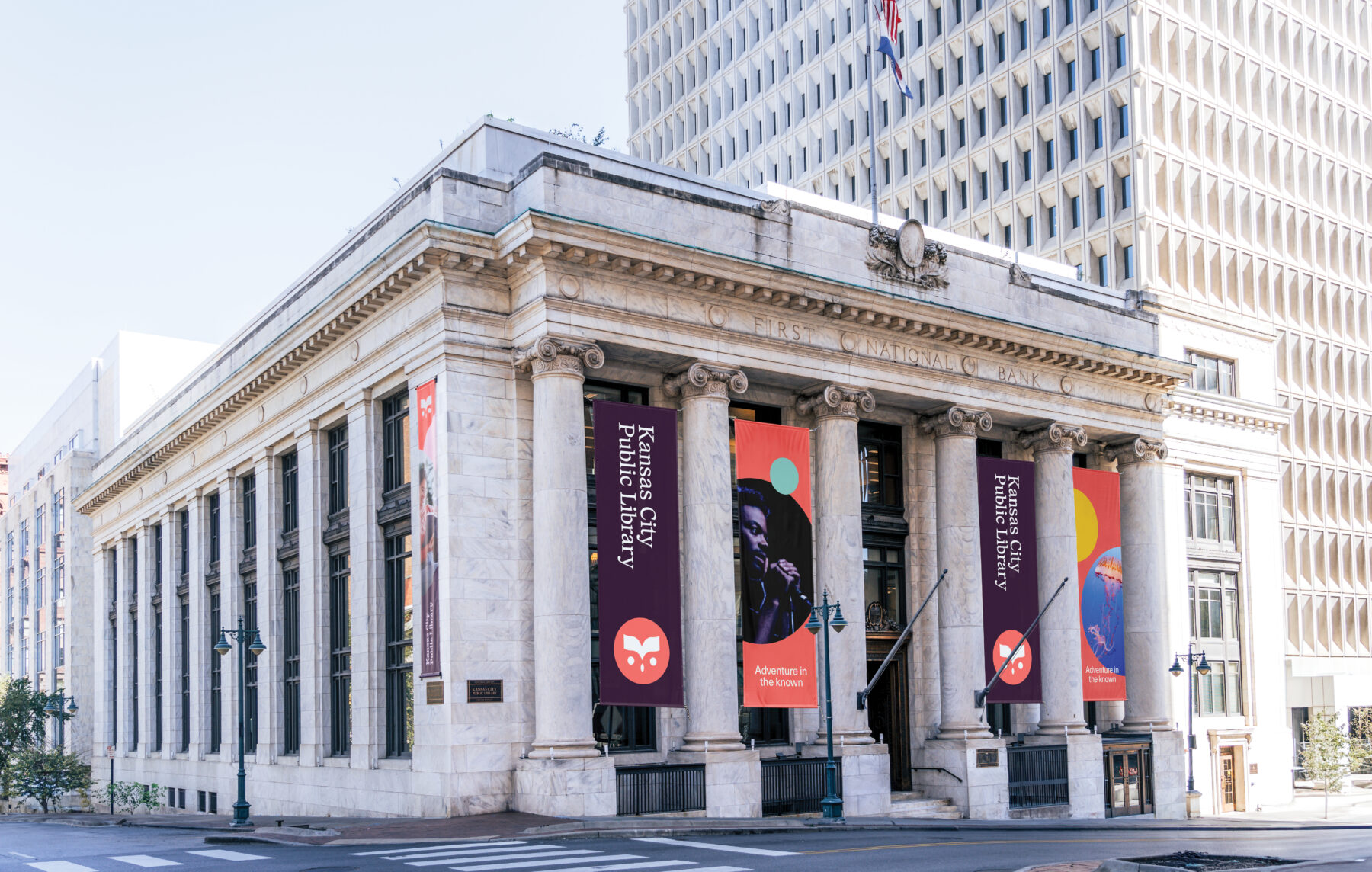
The Kansas City Public Library enlisted Design Ranch to lead a rebranding initiative focused on promoting awareness of the library’s diverse array of programs and services offered to the public as one of the only free community resource centers in a city. The primary objective was to encourage greater engagement and involvement. Design Ranch was tasked with crafting a strategic and visually appealing brand identity that would showcase the breadth of library offerings and effectively convey the library’s role as a vital hub for knowledge, culture, and community enrichment—aimed to enhance pride and strengthen the library’s connection among residents, ultimately fostering stronger relationships between the library and its local constituent.
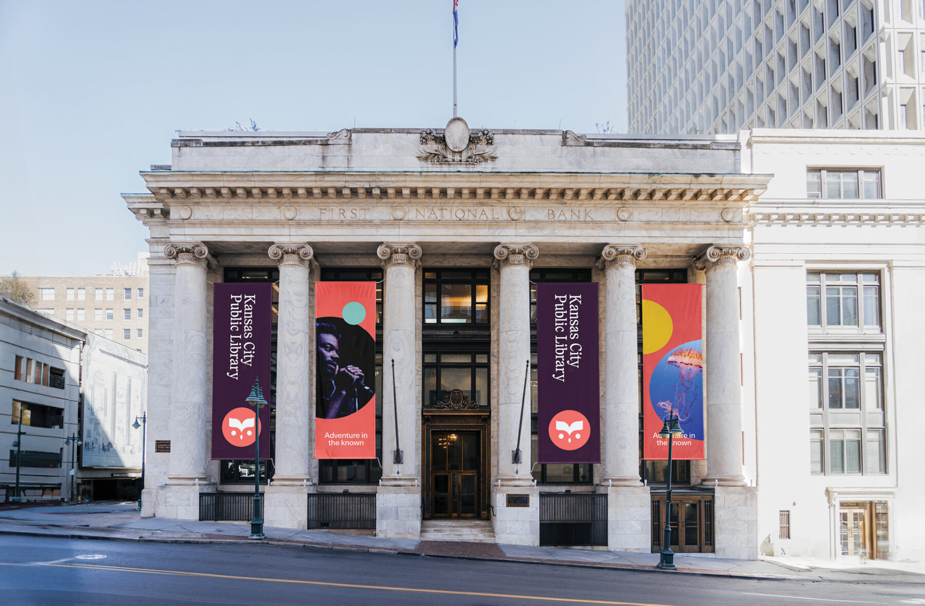
approach
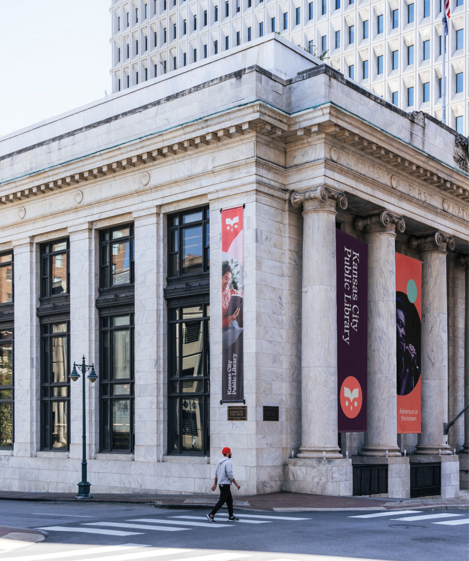
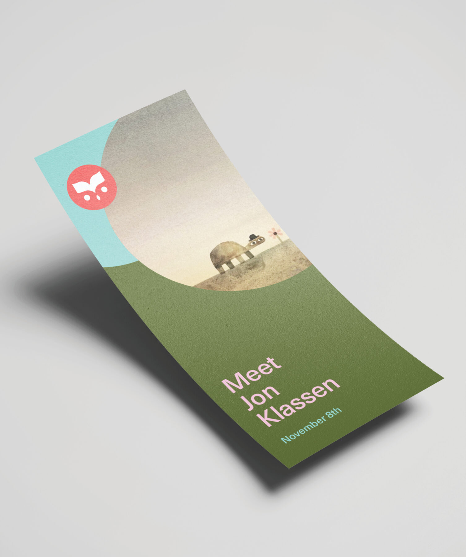
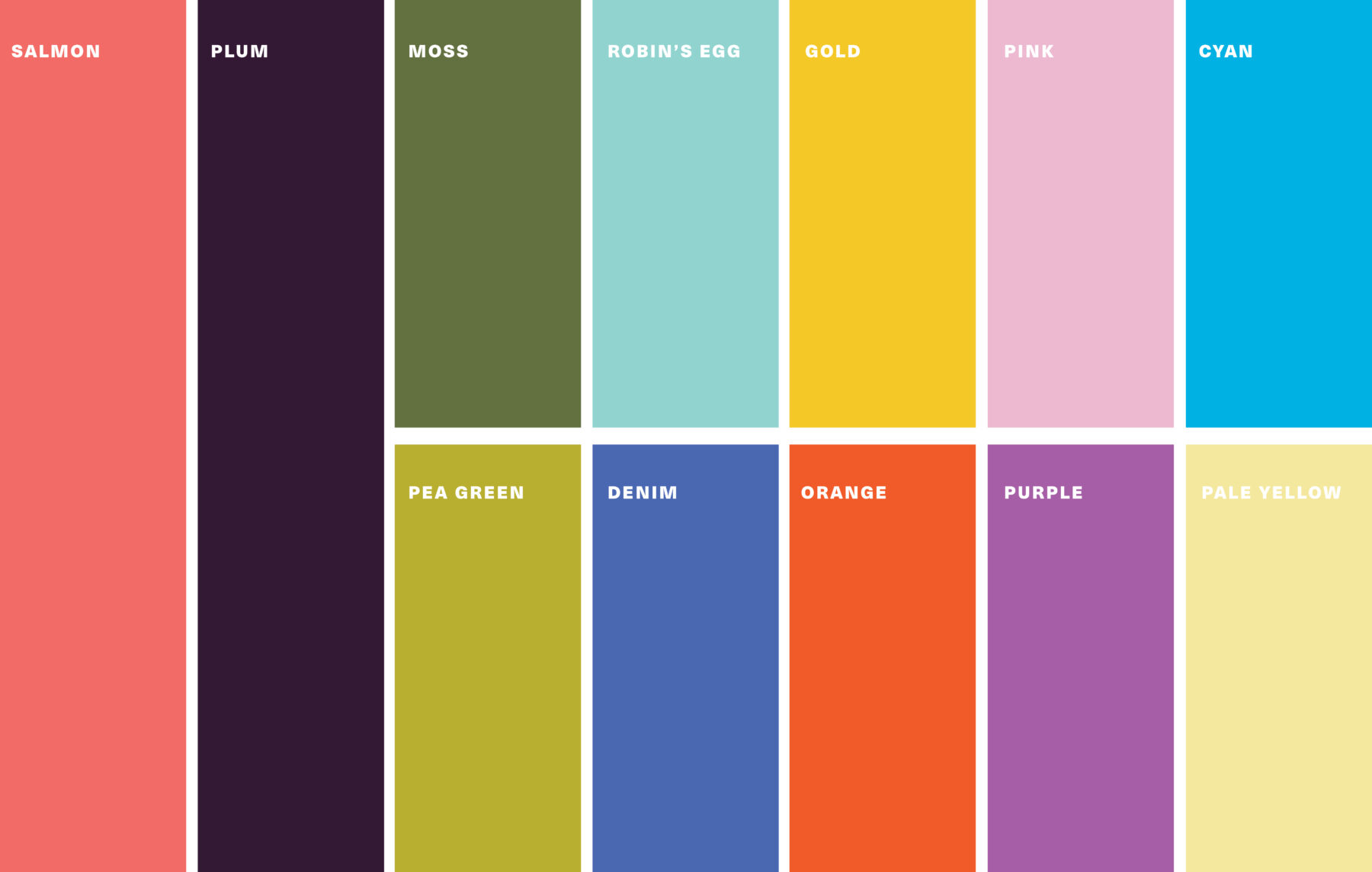
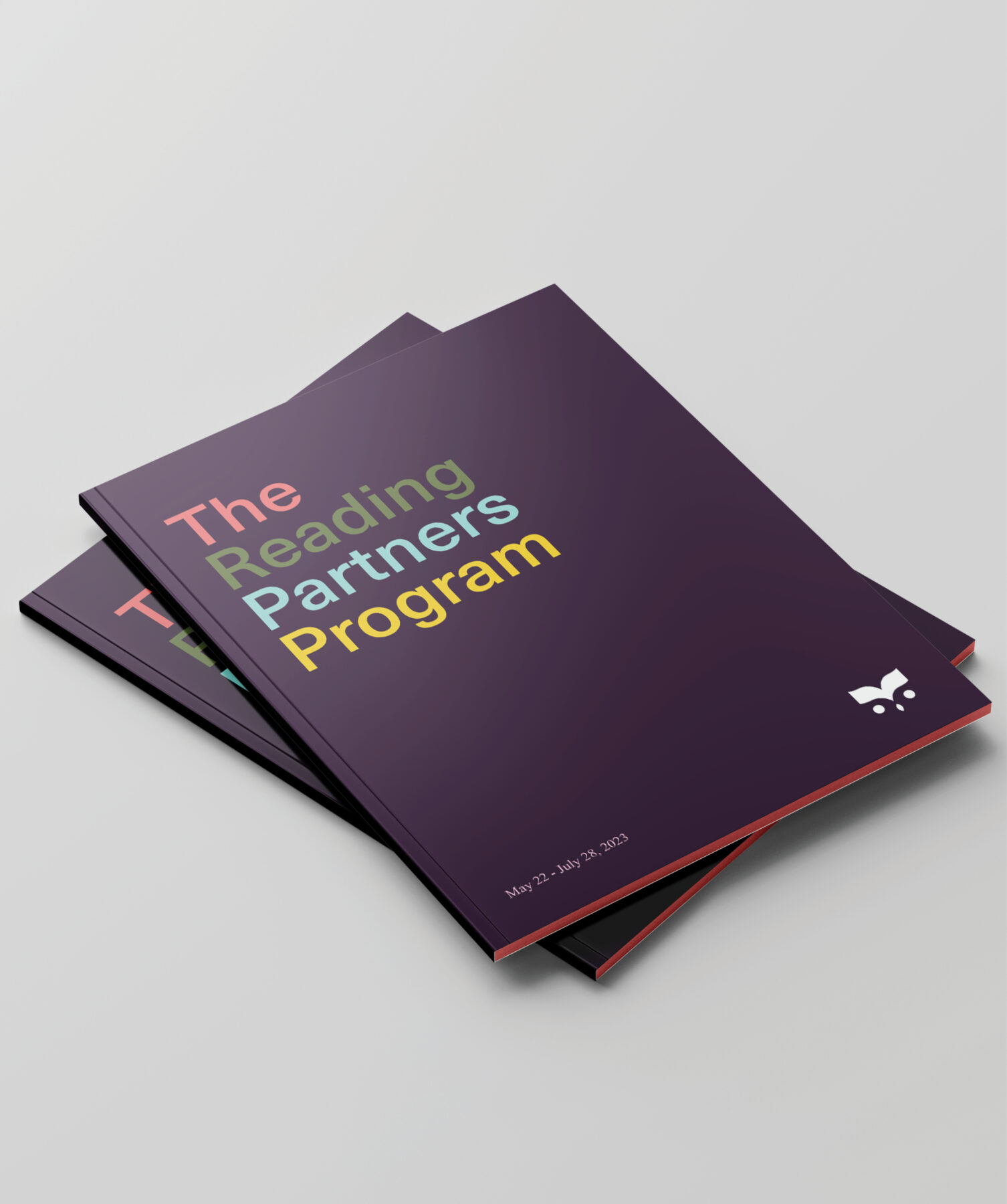
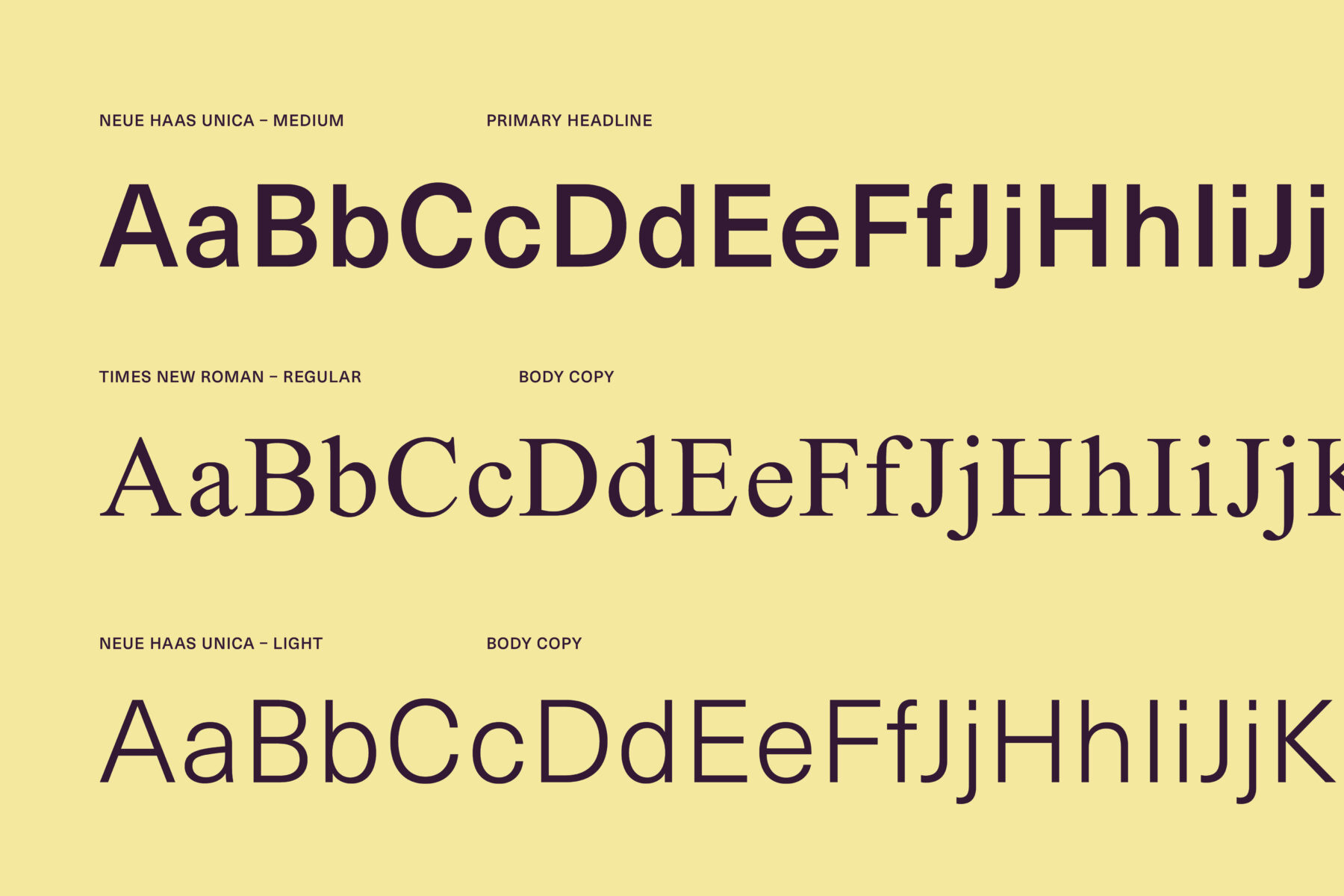
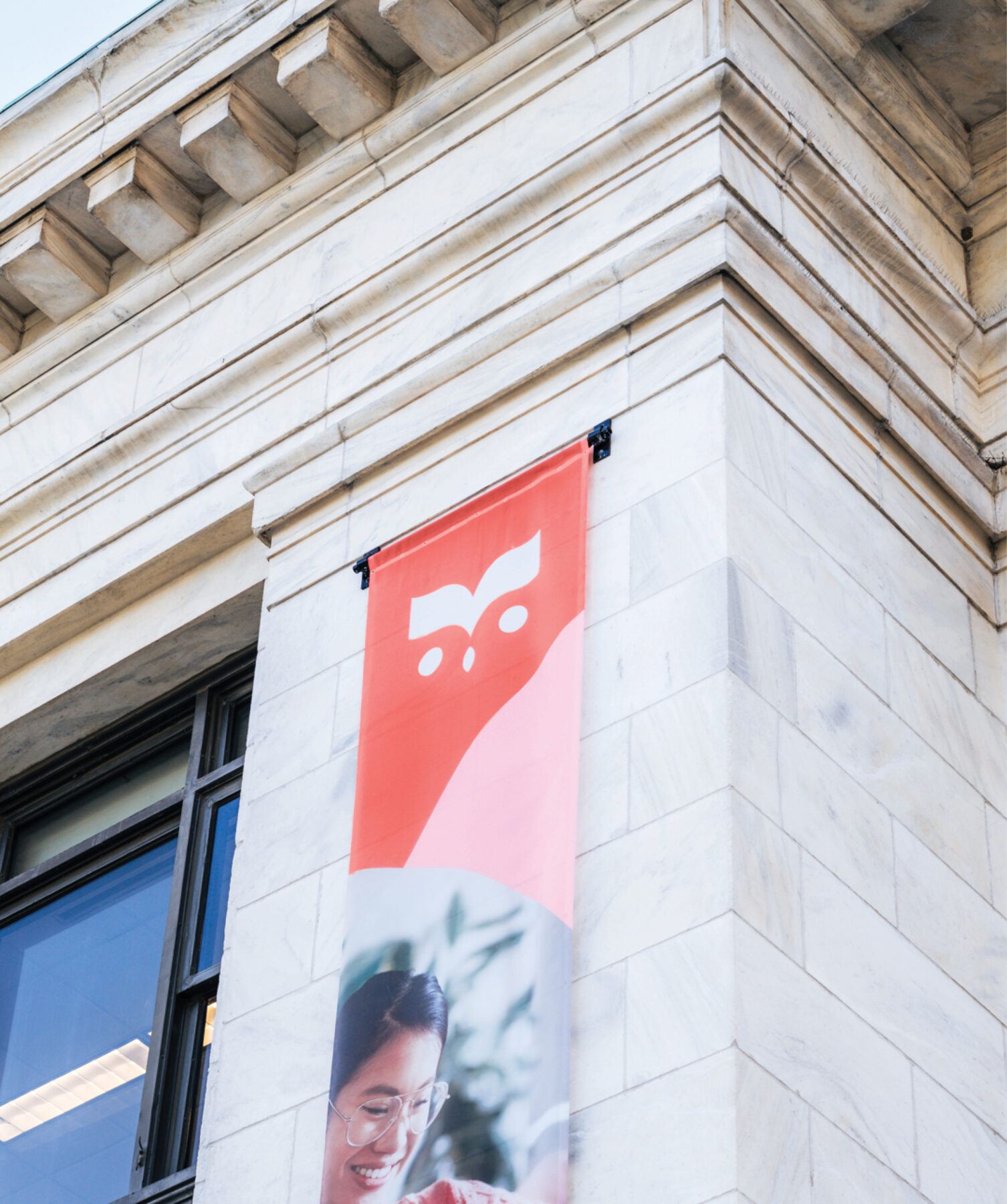
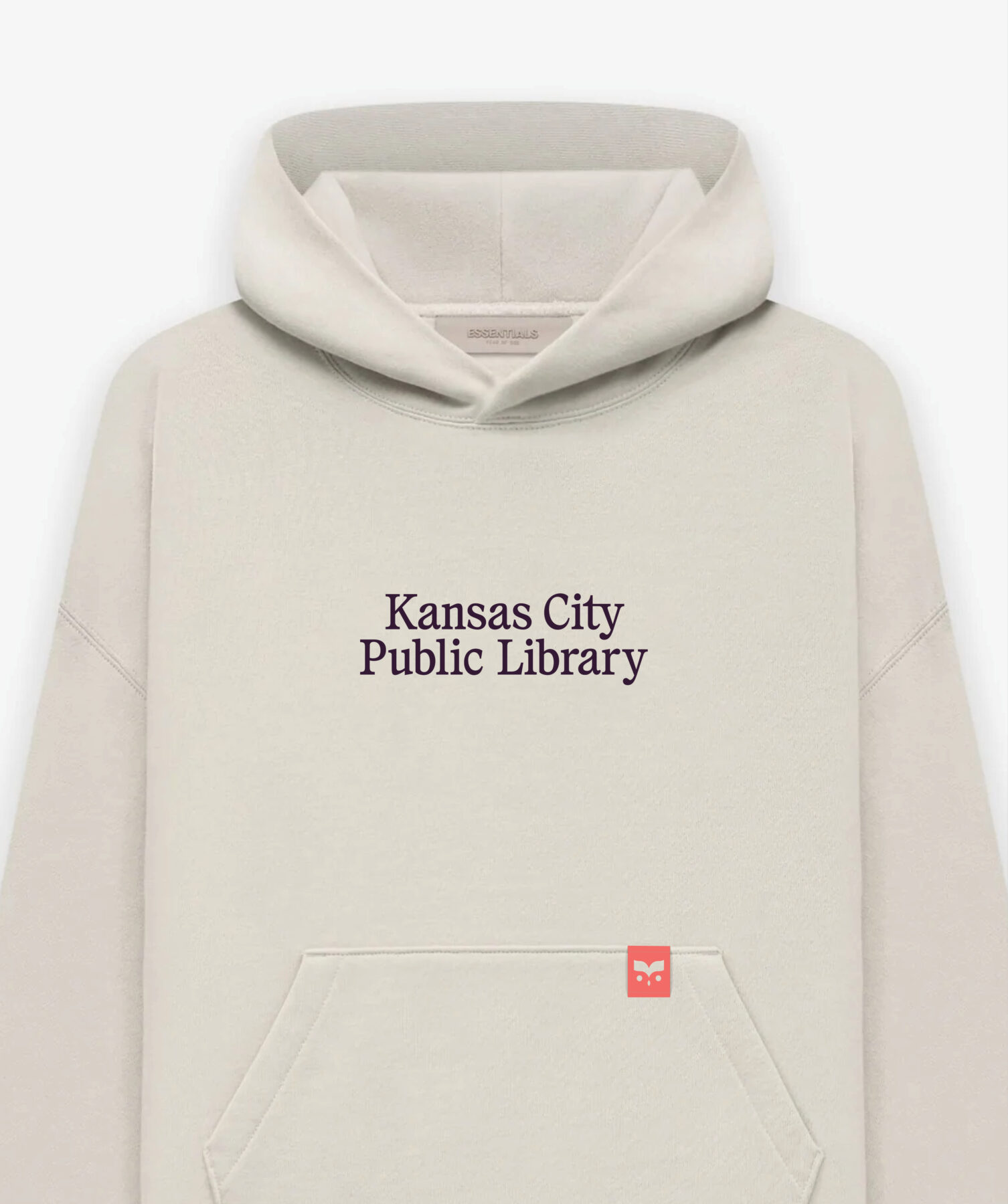
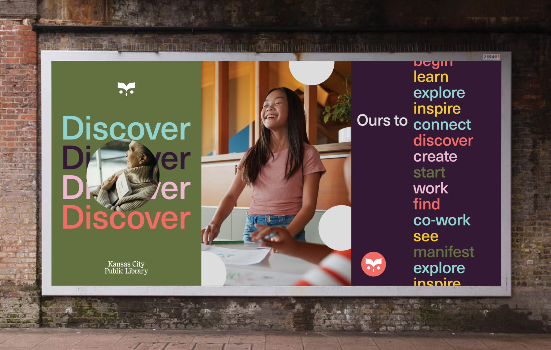
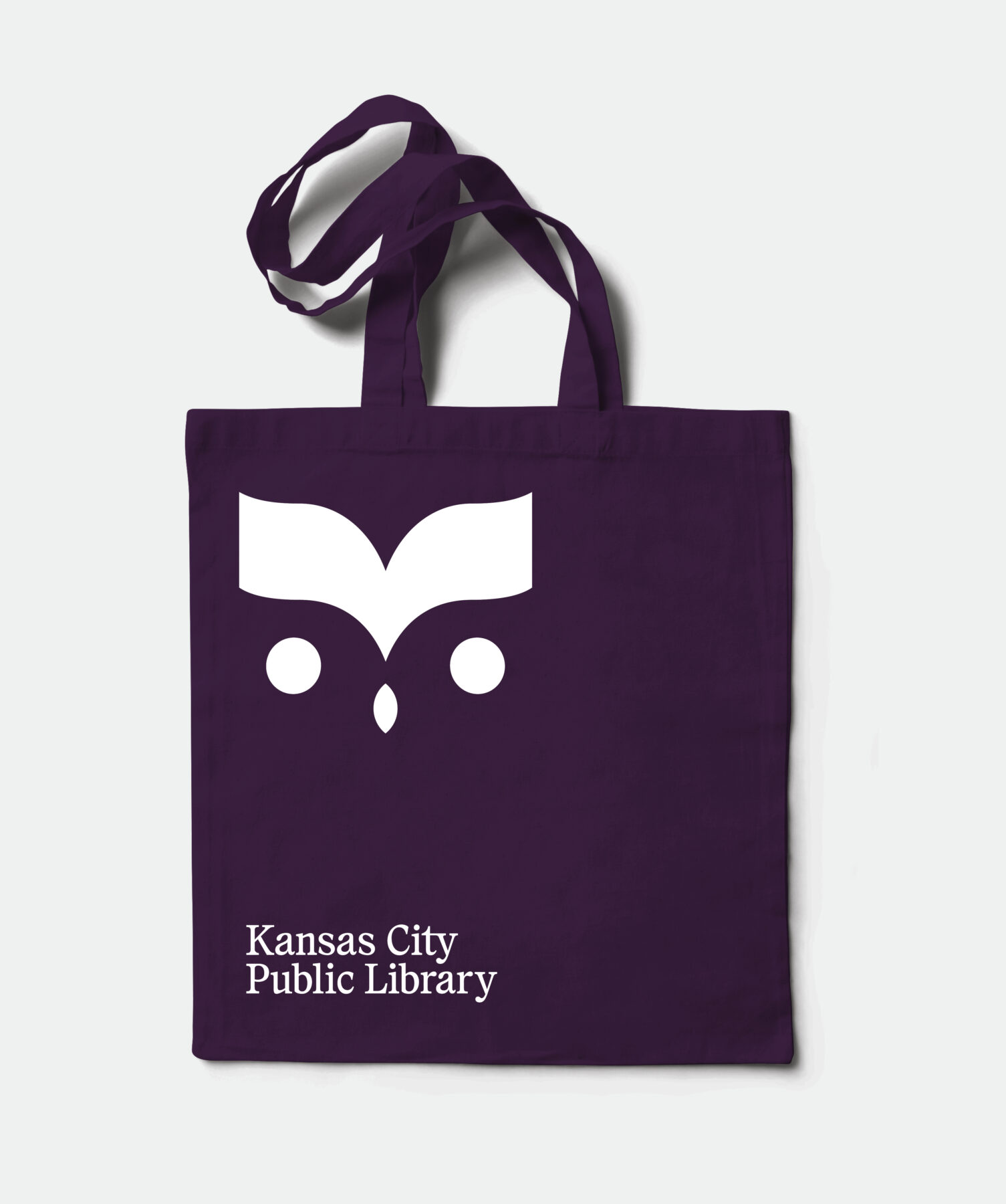
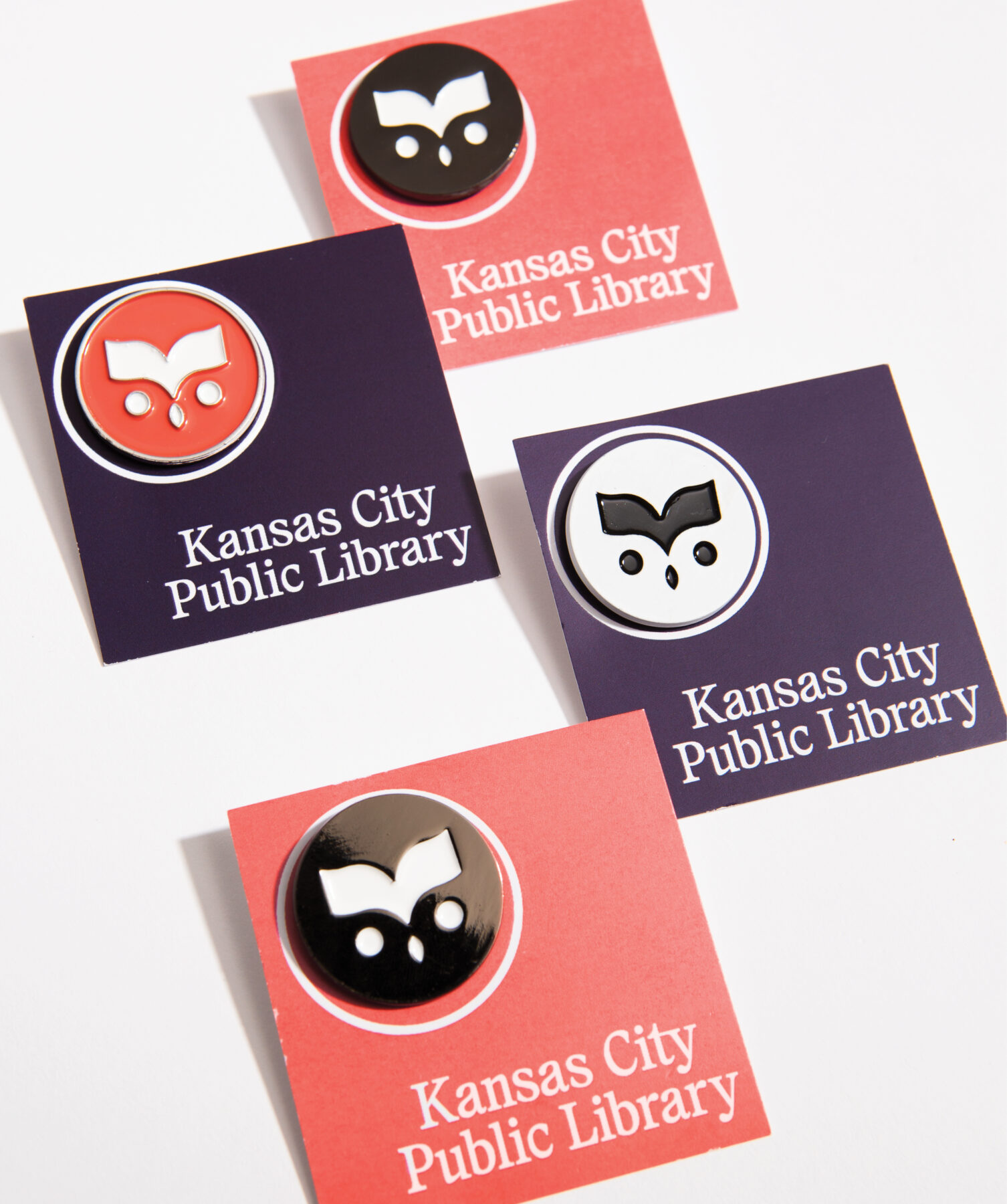
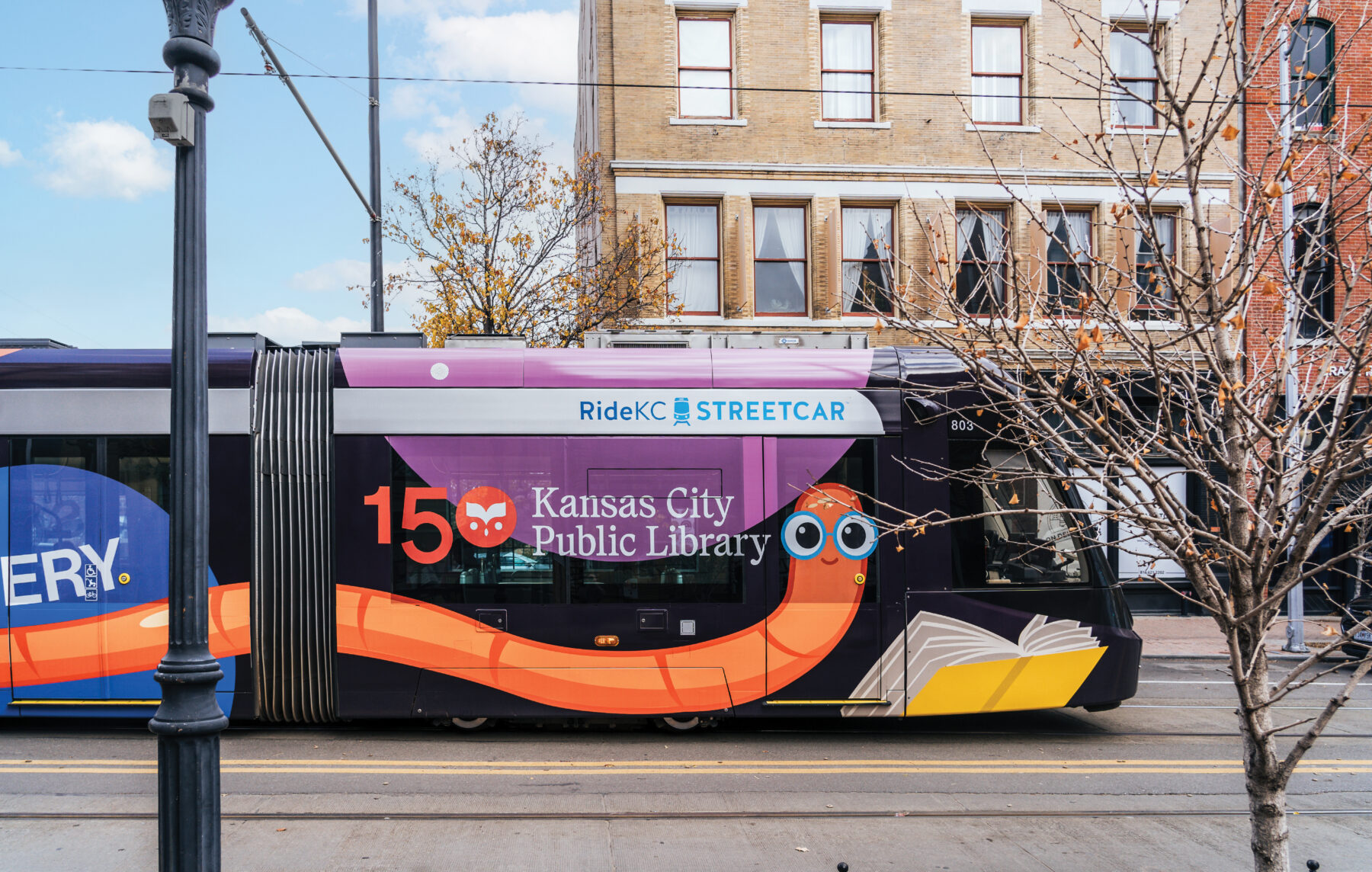
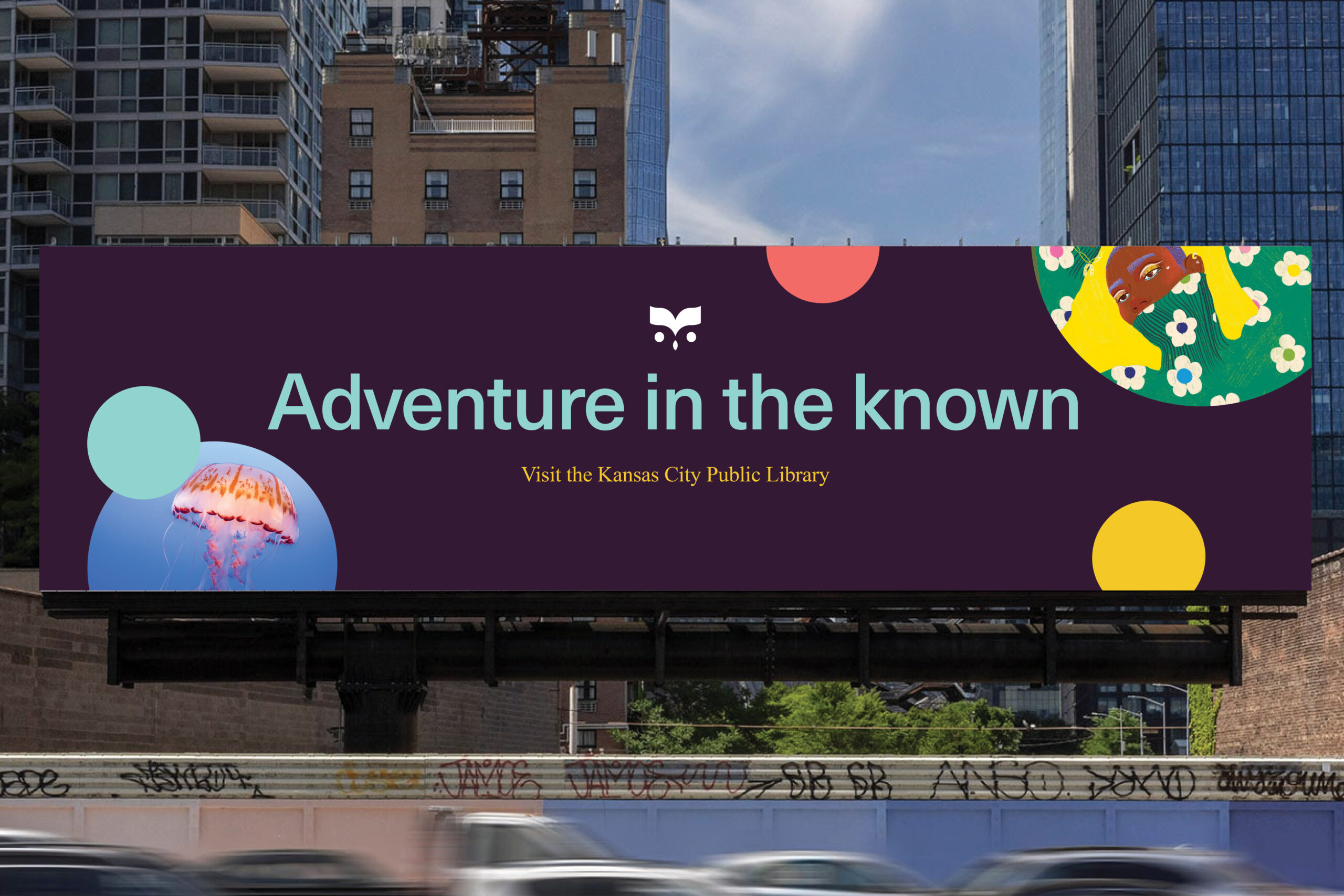
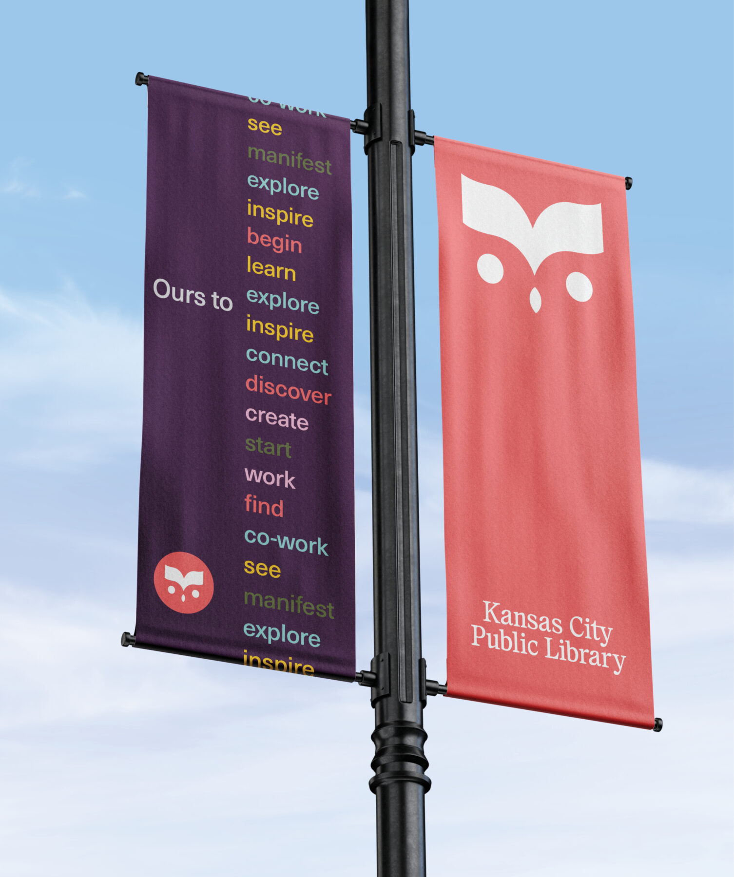
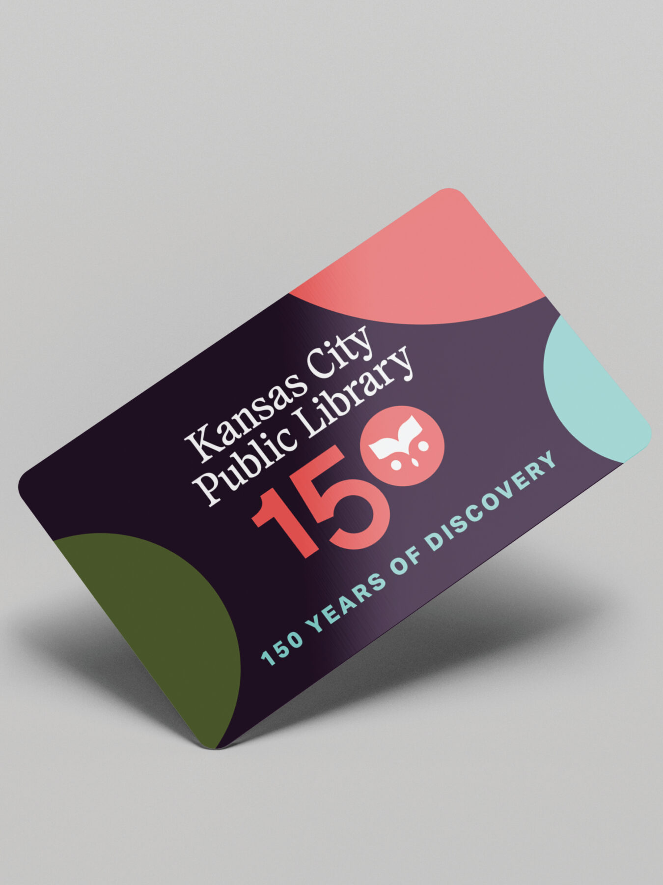
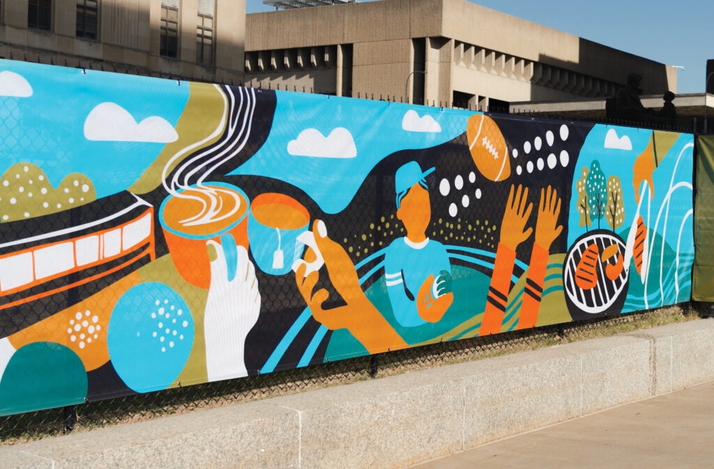
Design Ranch created a new logo that embodies inclusivity and diversity while presenting a modern and inviting image, seamlessly uniting the library’s distinct branches under one iconic emblem featuring an owl encased within a circle. The owl signifies a connection to the diverse population the library serves, with its brow shaped as an open book, reinforcing themes of learning and knowledge. The circle represents the library as a welcoming, inclusive space for all. We also crafted a complementary logotype inspired by classic book fonts to balance friendliness and readability with the more graphic owl icon. Beyond the logo, we developed a flexible yet uniform brand identity reflecting the rich experience of exploring, learning, and connecting within the library through diverse photography and an assorted yet harmonized color palette. This multifaceted approach showcases the library as a dynamic, forward-thinking institution that embraces technology while catering to the evolving needs of its diverse community.