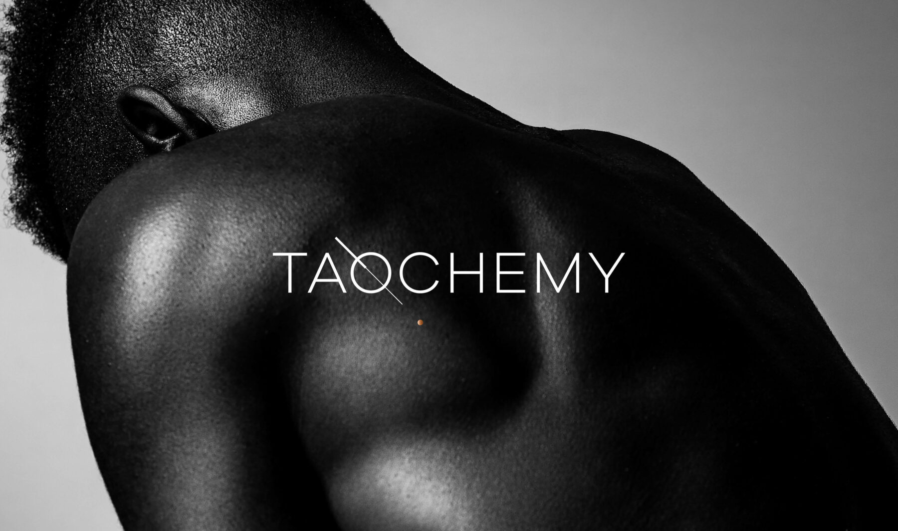
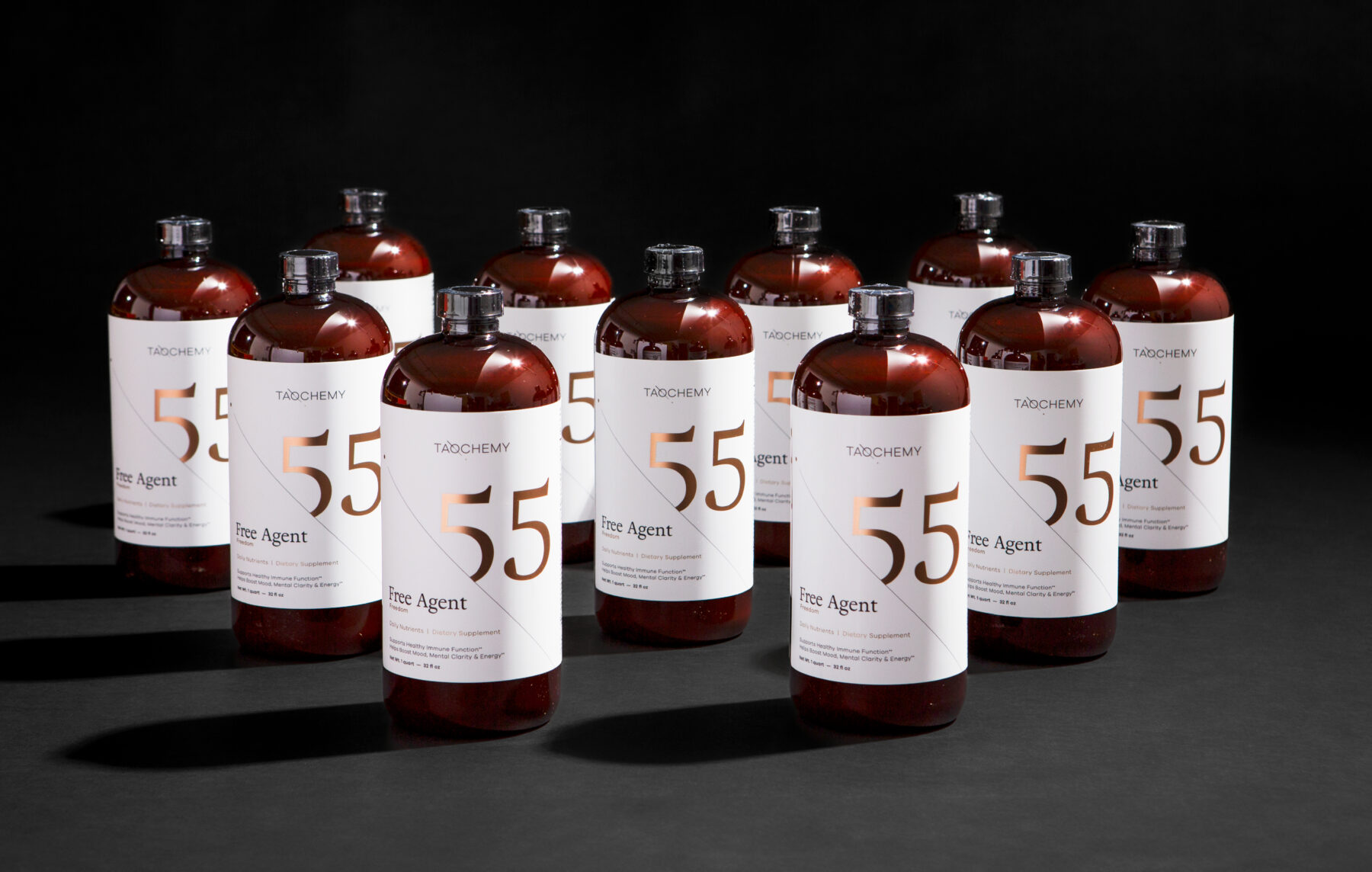
Taochemy
Awakening interest with positive innuendo
challenge
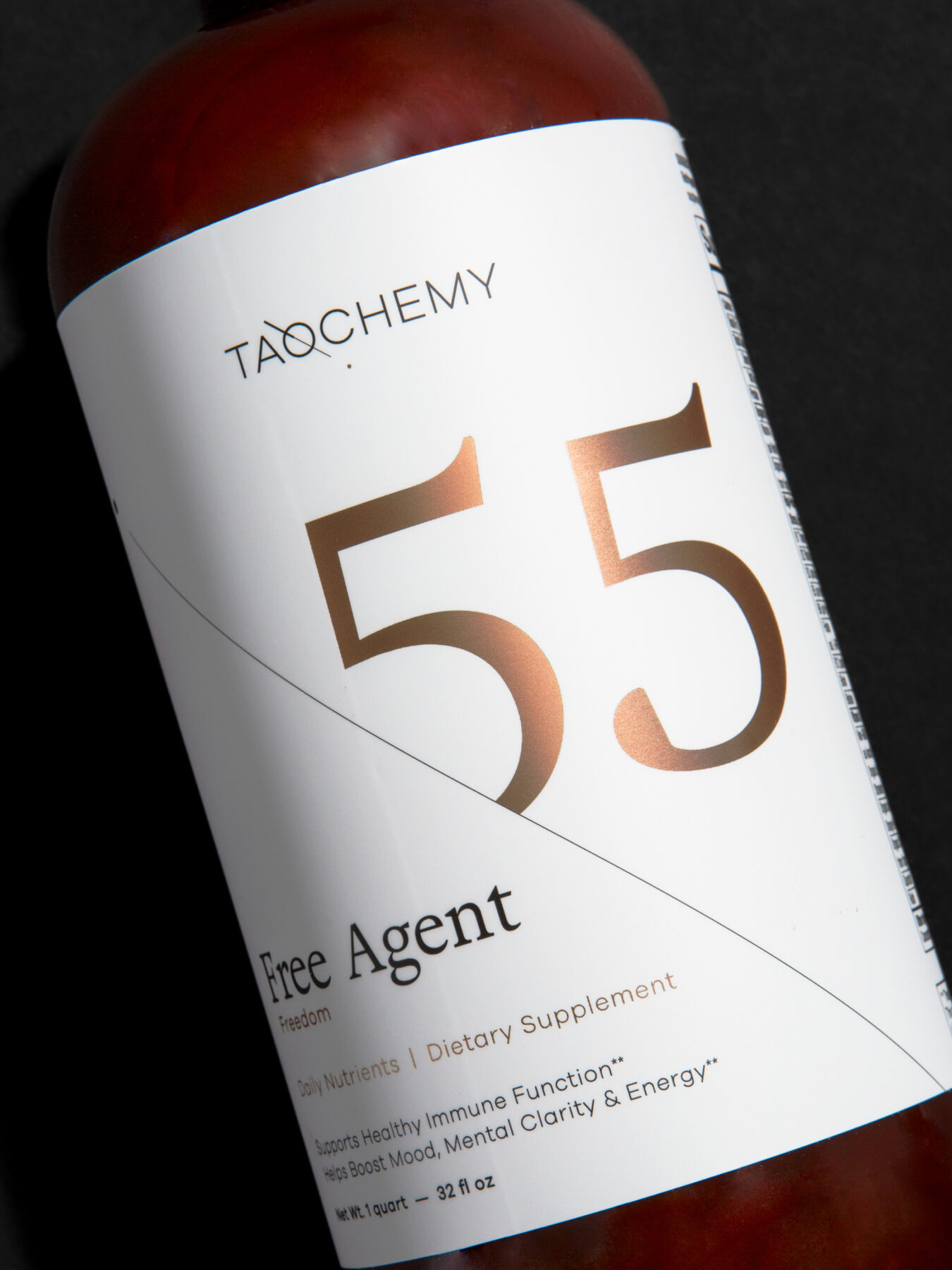
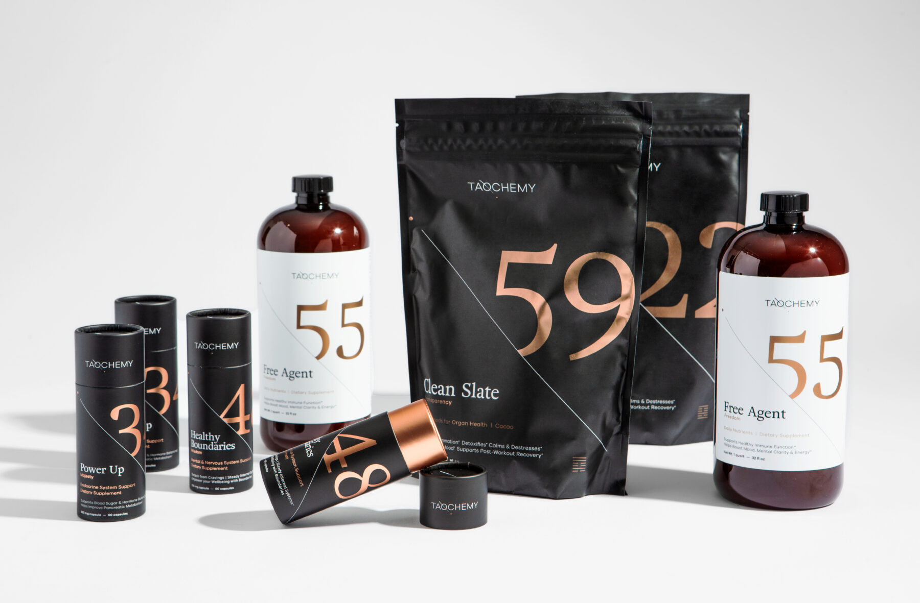
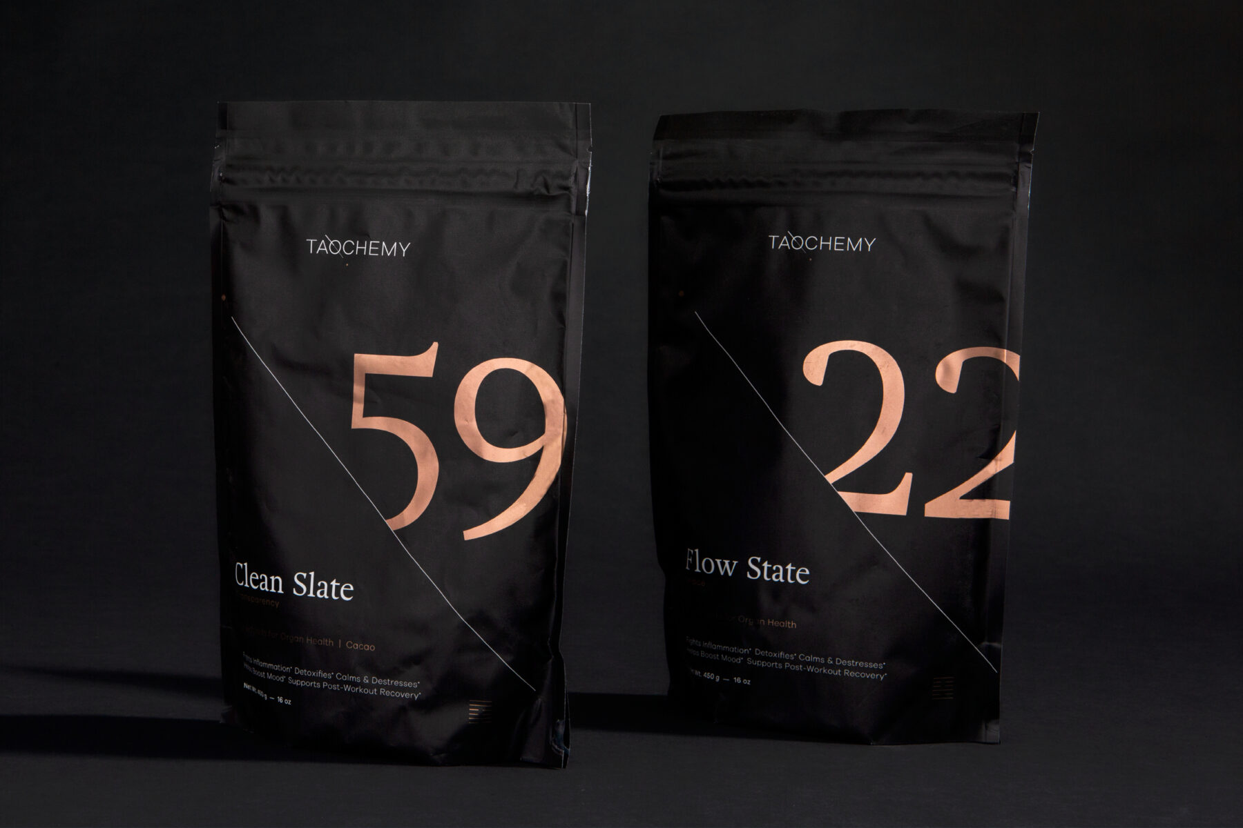
With a defined and proven acupuncture treatment process to improve mental health issues, Taochemy needed a brand that would mirror the company’s forward-thinking outlook. They wanted to develop both a strategic approach and a distinct identity to align with the company’s growth-oriented vision.
approach
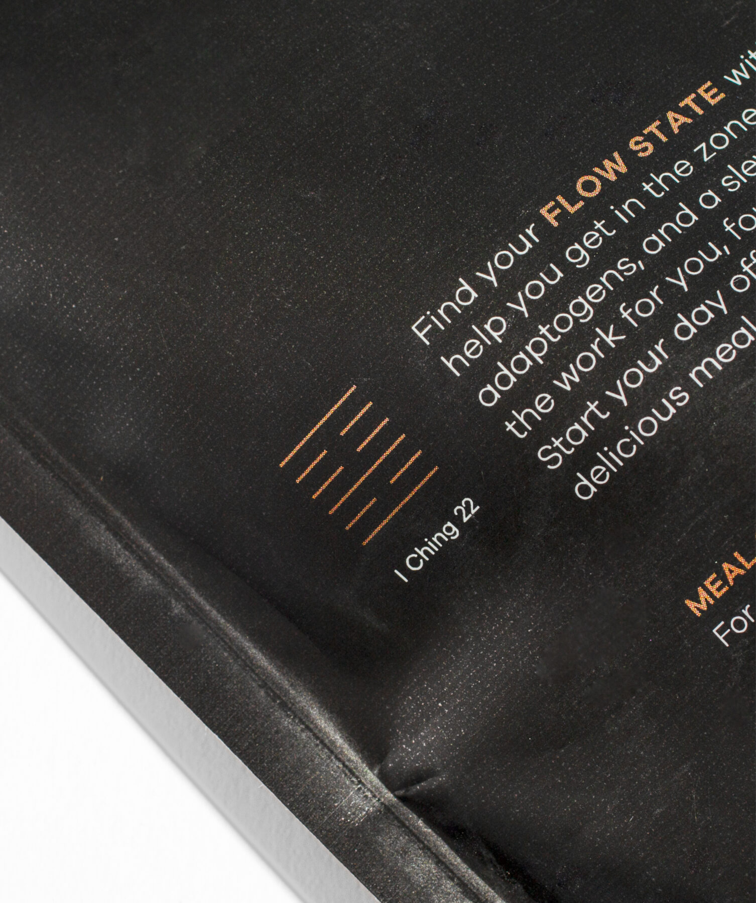
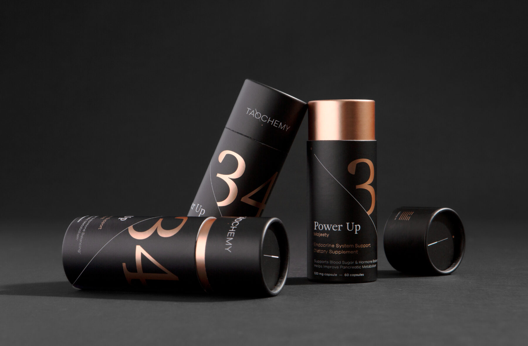
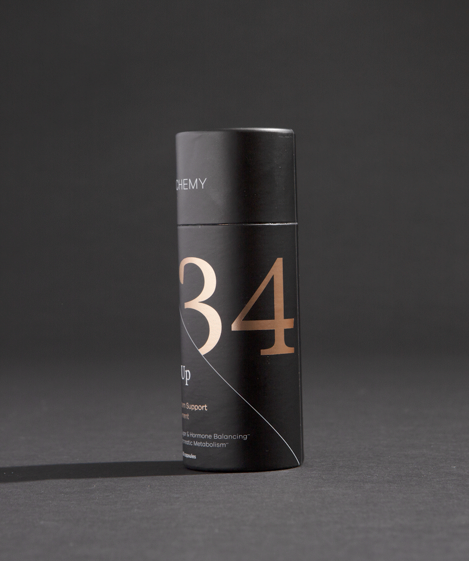
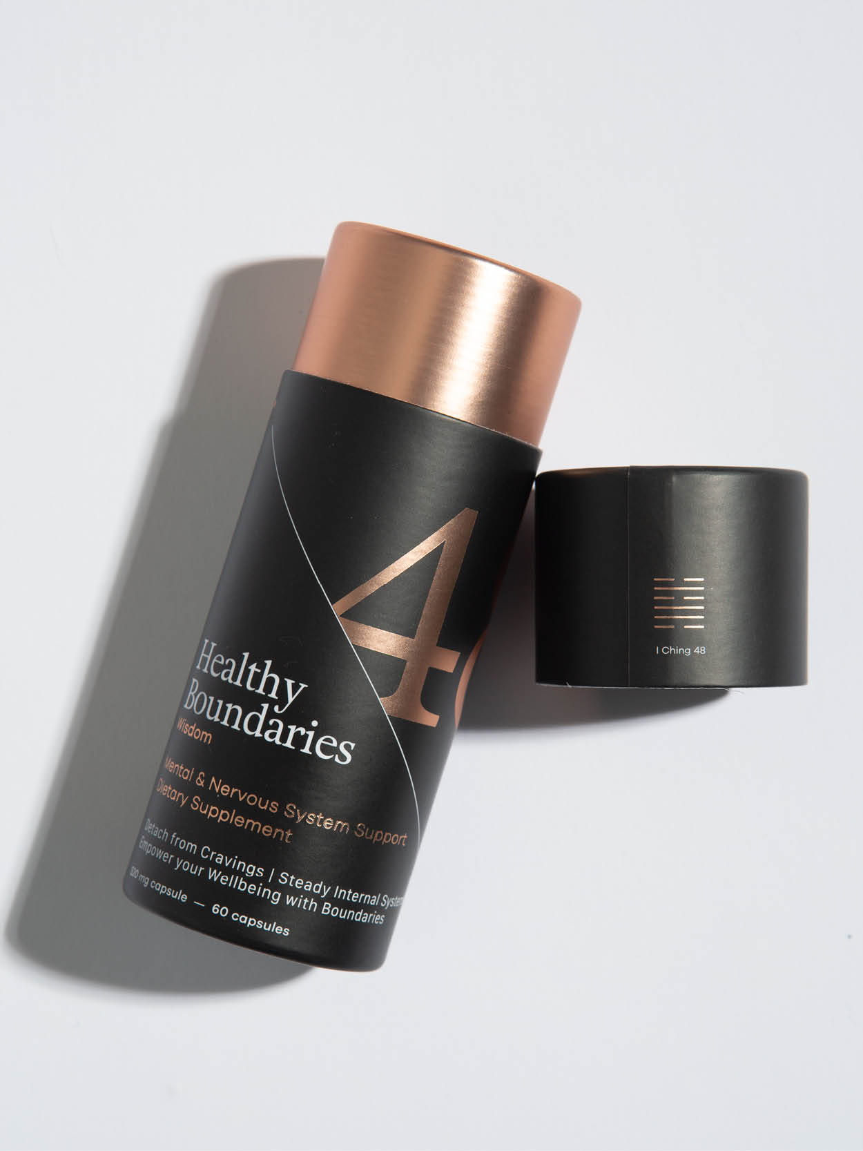
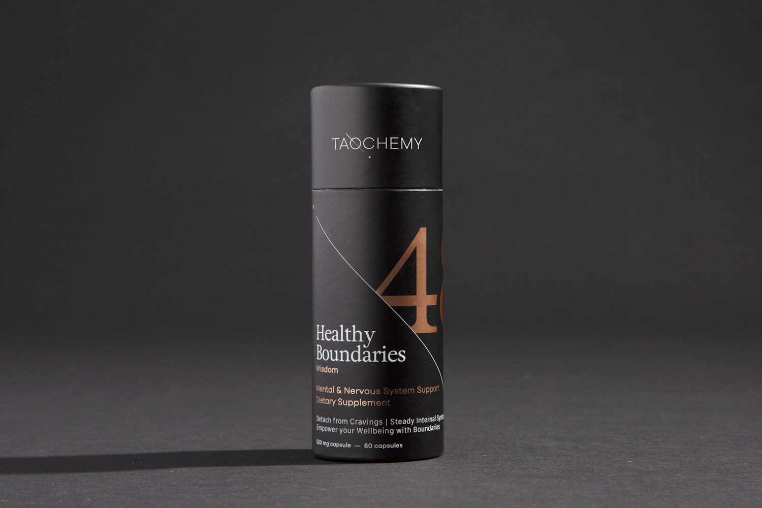
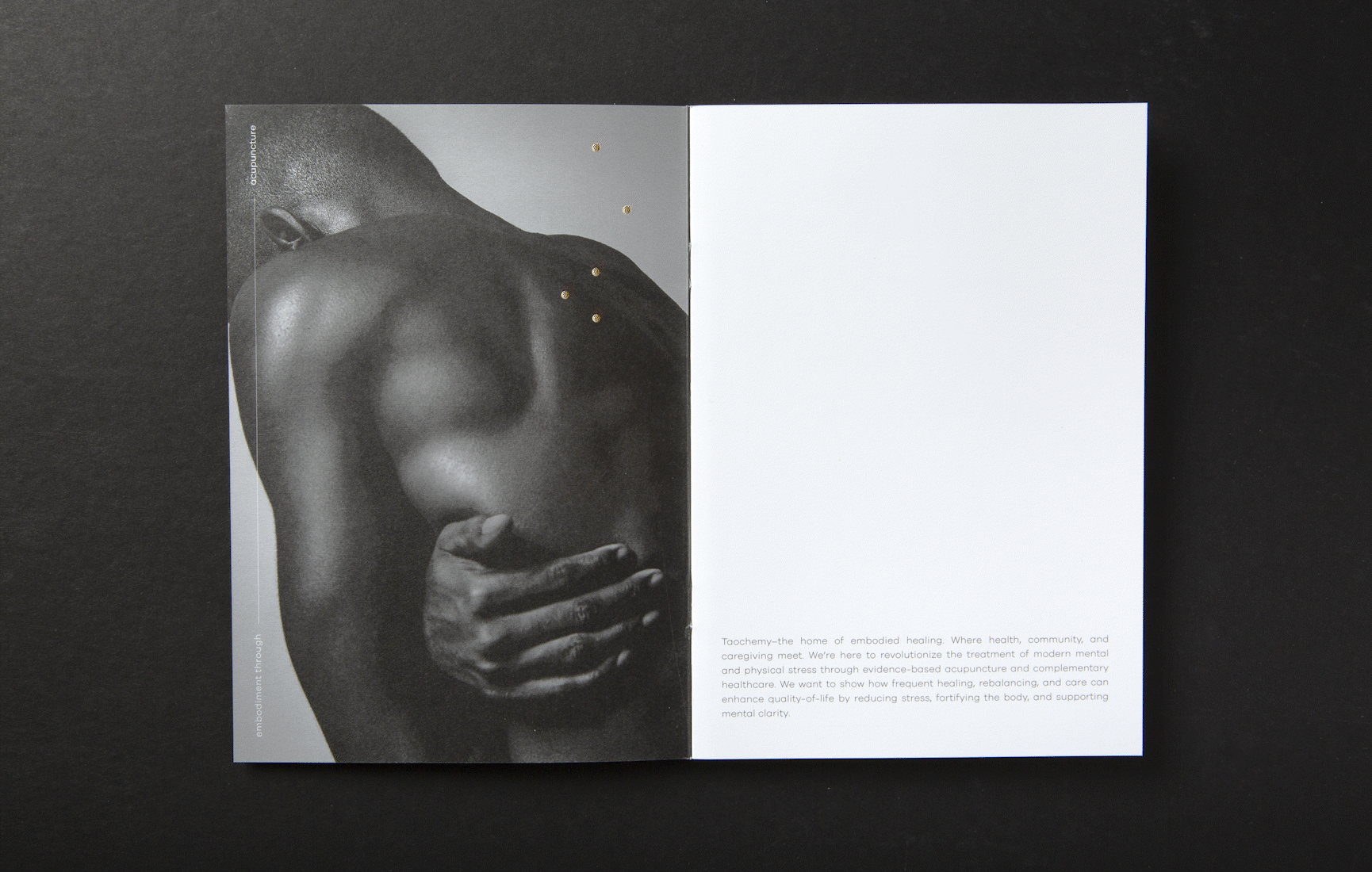
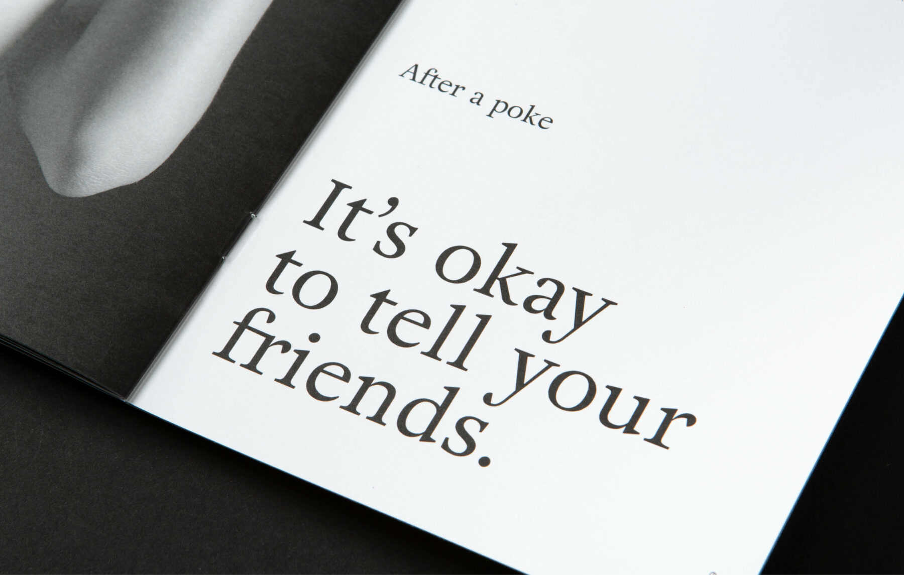
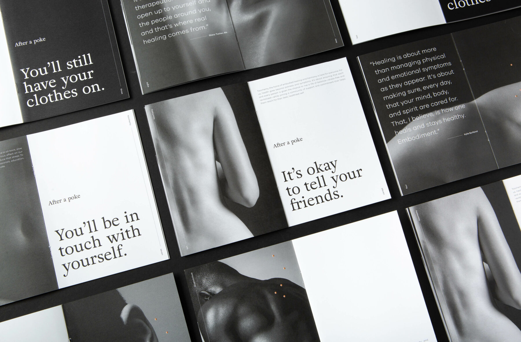
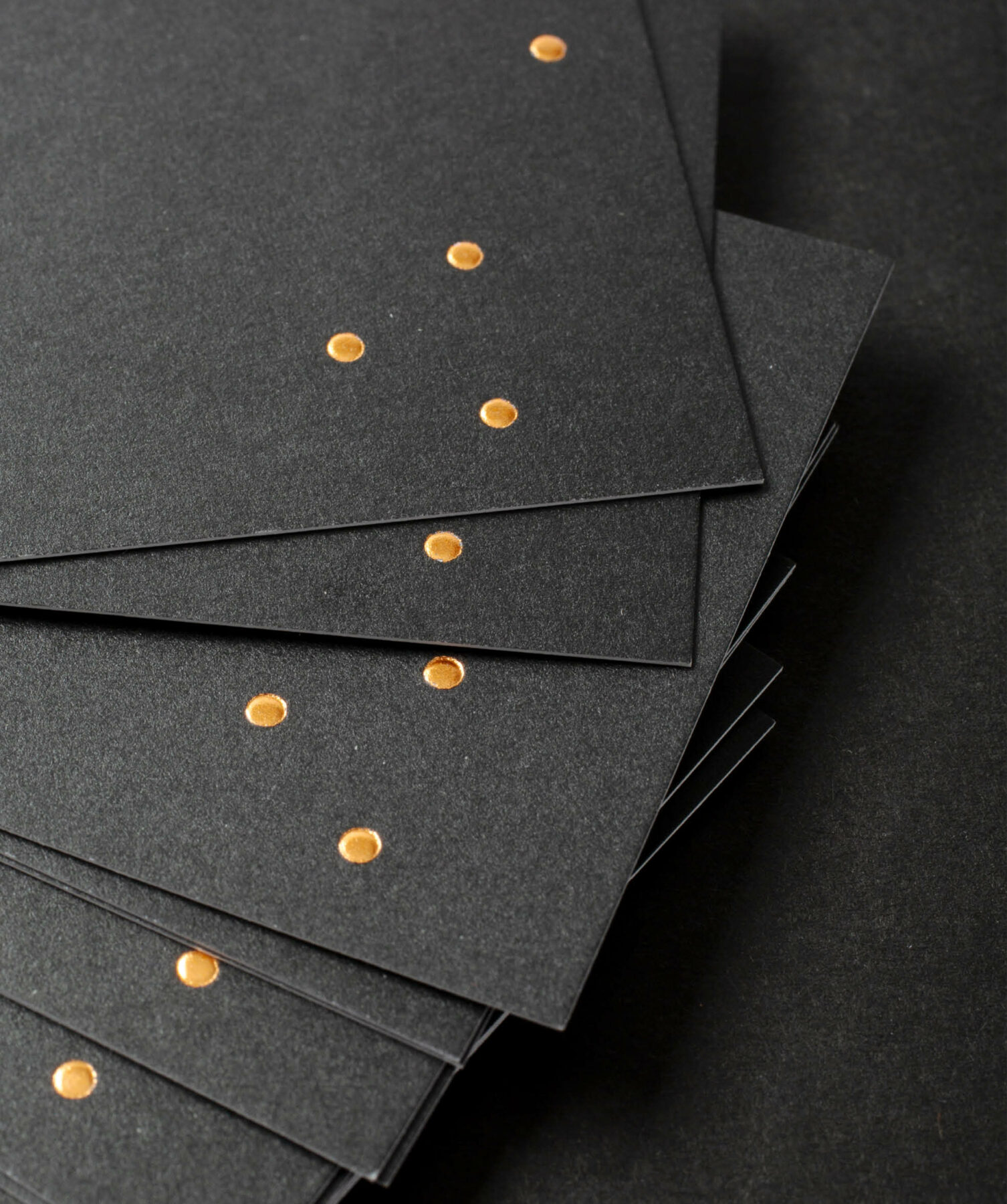
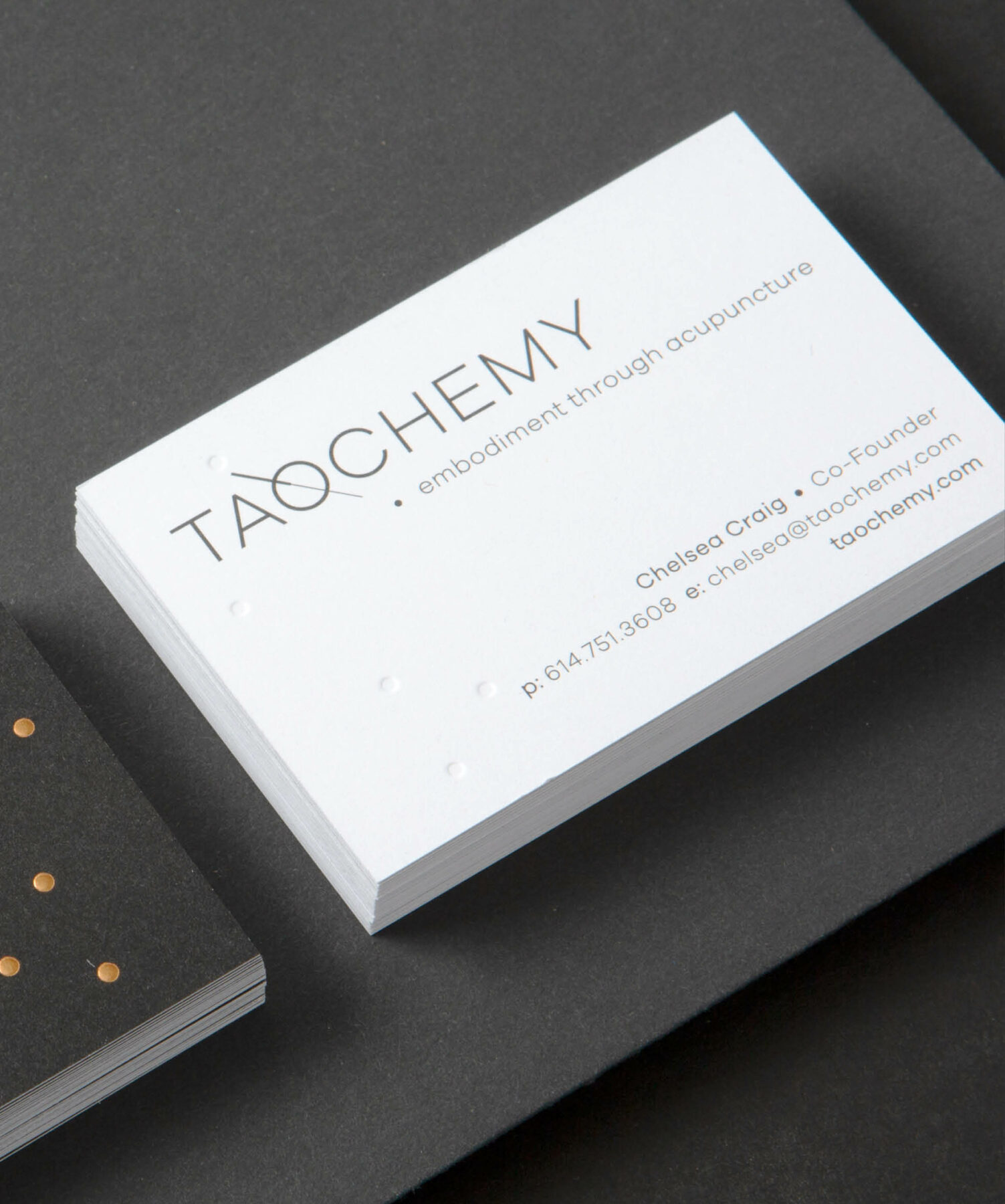
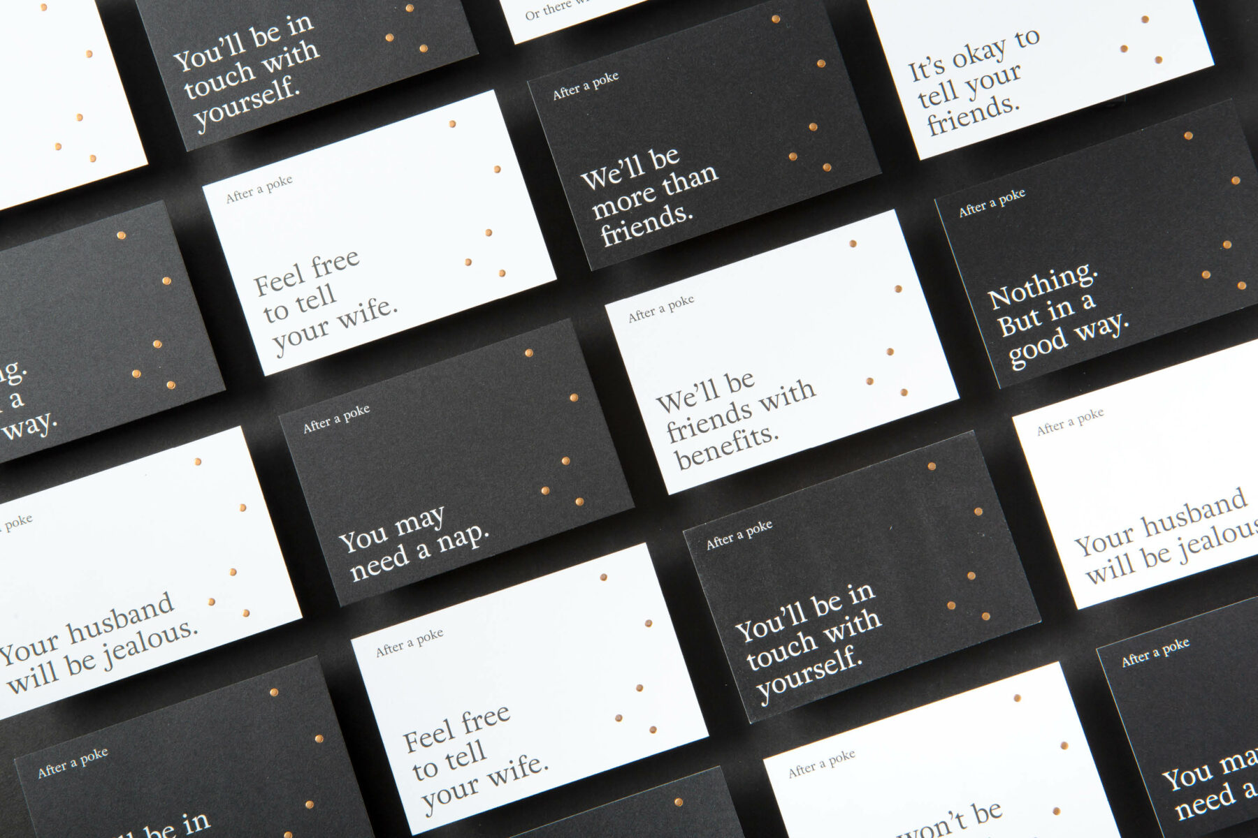
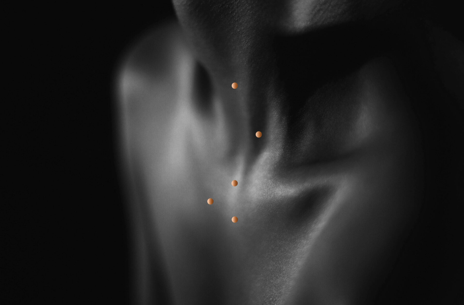
Our initial step involved crafting a refined logo and brand system that mirrors Taochemy’s five-point acupuncture process. We incorporated a copper metallic foil into the design to evoke the healing essence of acupuncture, represented by the five dots and their alignment on the ear. We harnessed the power of innuendo in our headlines to grab attention and used black-and-white photography to infuse the brand with a sense of drama and mood.