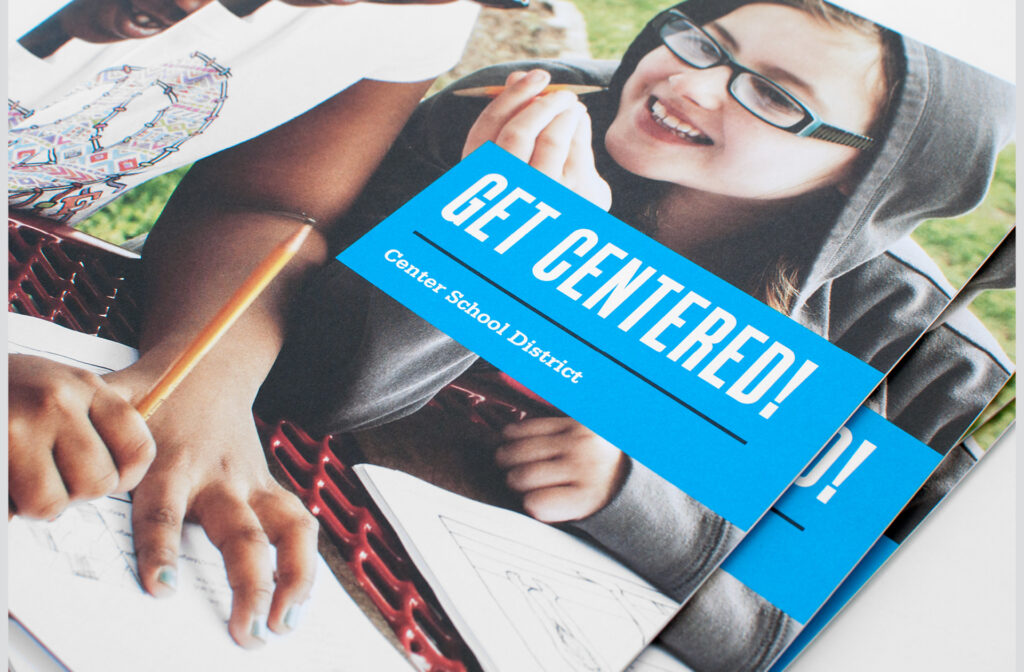
Center School District – Center Friends
Putting magic into mentorship
challenge
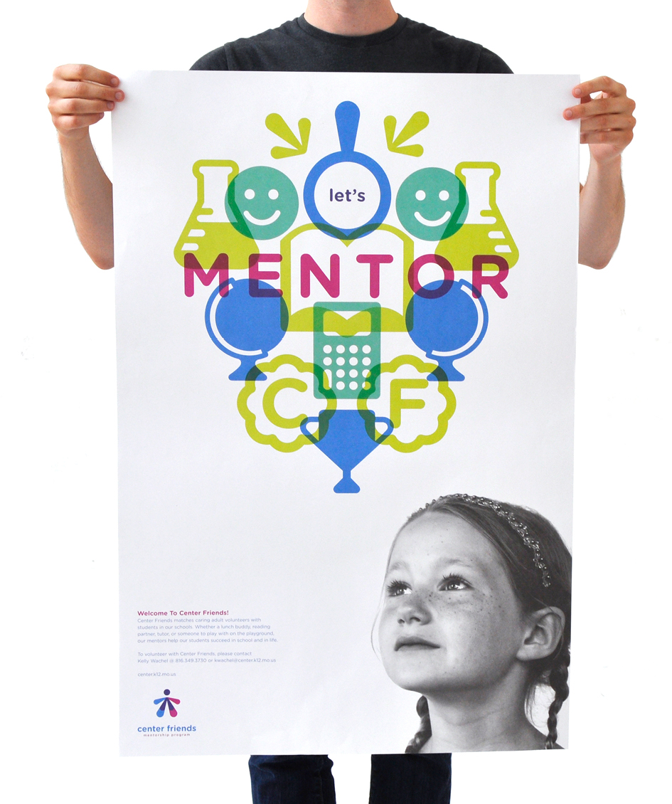
Center School District faced the challenge of branding its mentorship program, Center Friends, which relies on community and business leader involvement. The district wanted to solidify its reputation and inspire confidence among potential mentors, differentiate the program in a competitive landscape, and appeal to mentors, students, and their families. They needed a well-defined brand to provide consistency in messaging, ensure recognition, and contribute to long-term sustainability, igniting interest and support for the program among diverse stakeholders and ultimately achieving the mission of fostering mentorship and personal growth within the community.
approach
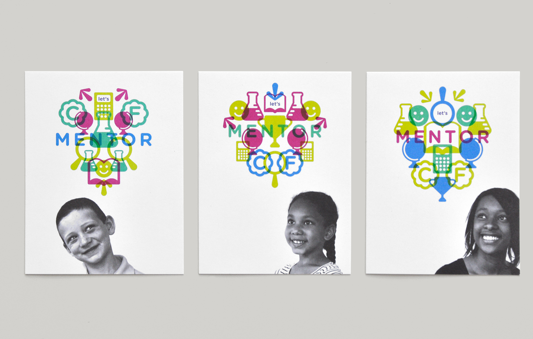
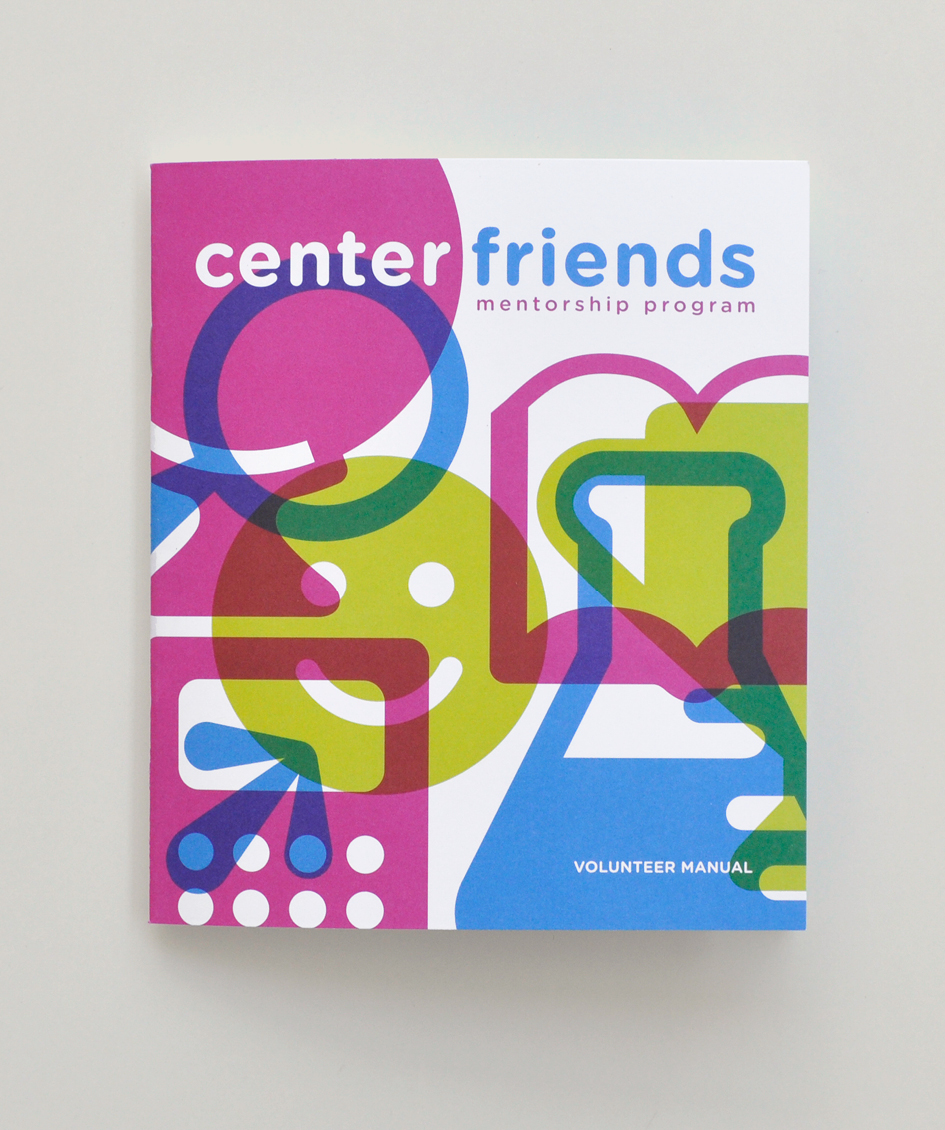
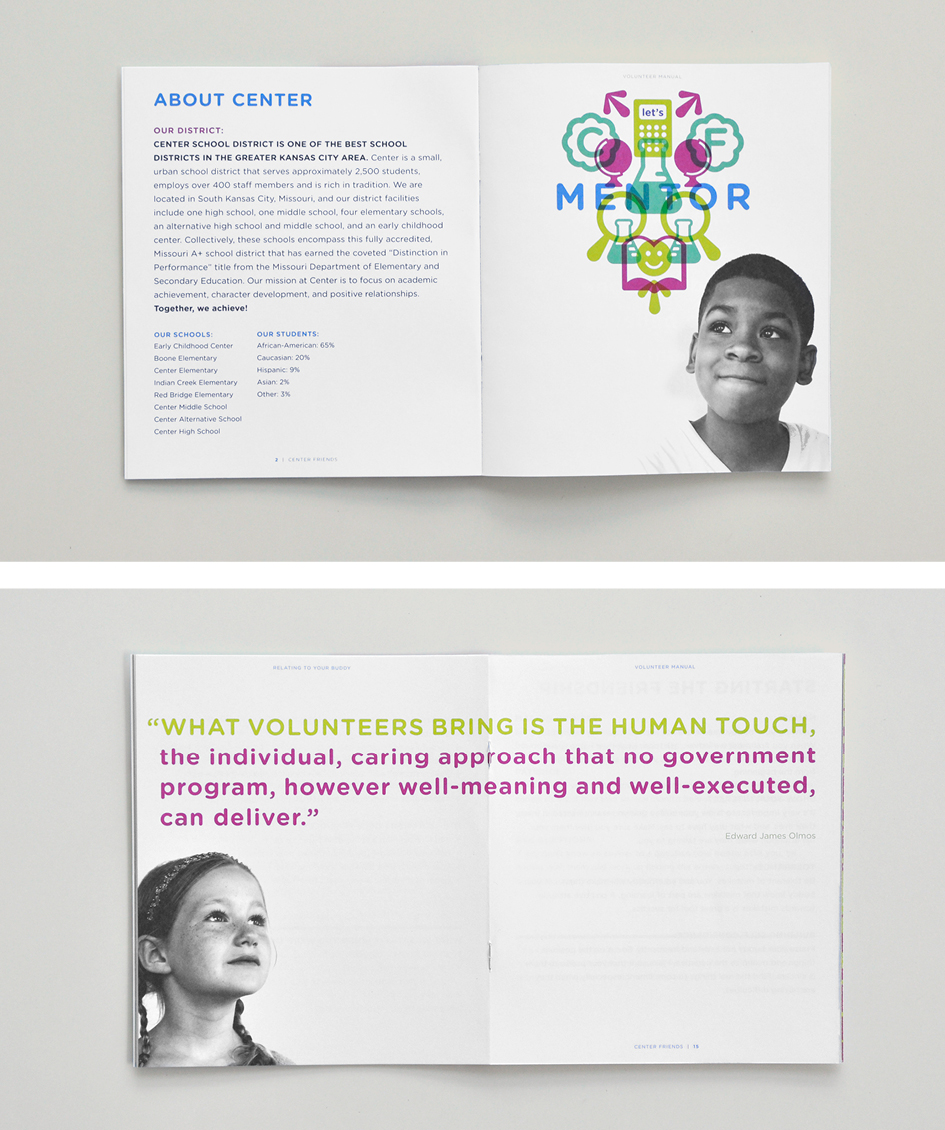
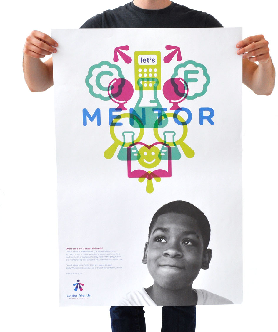
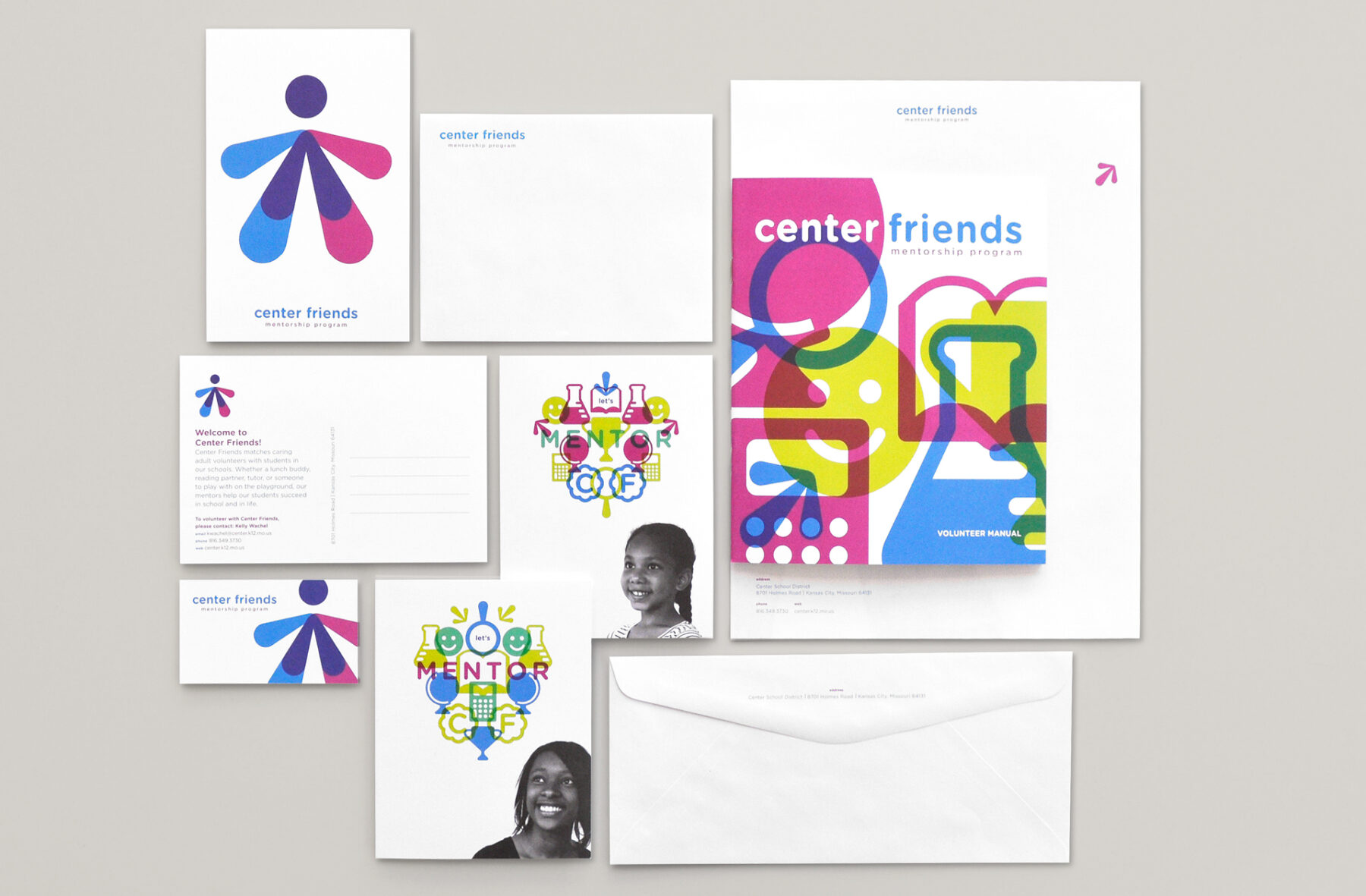
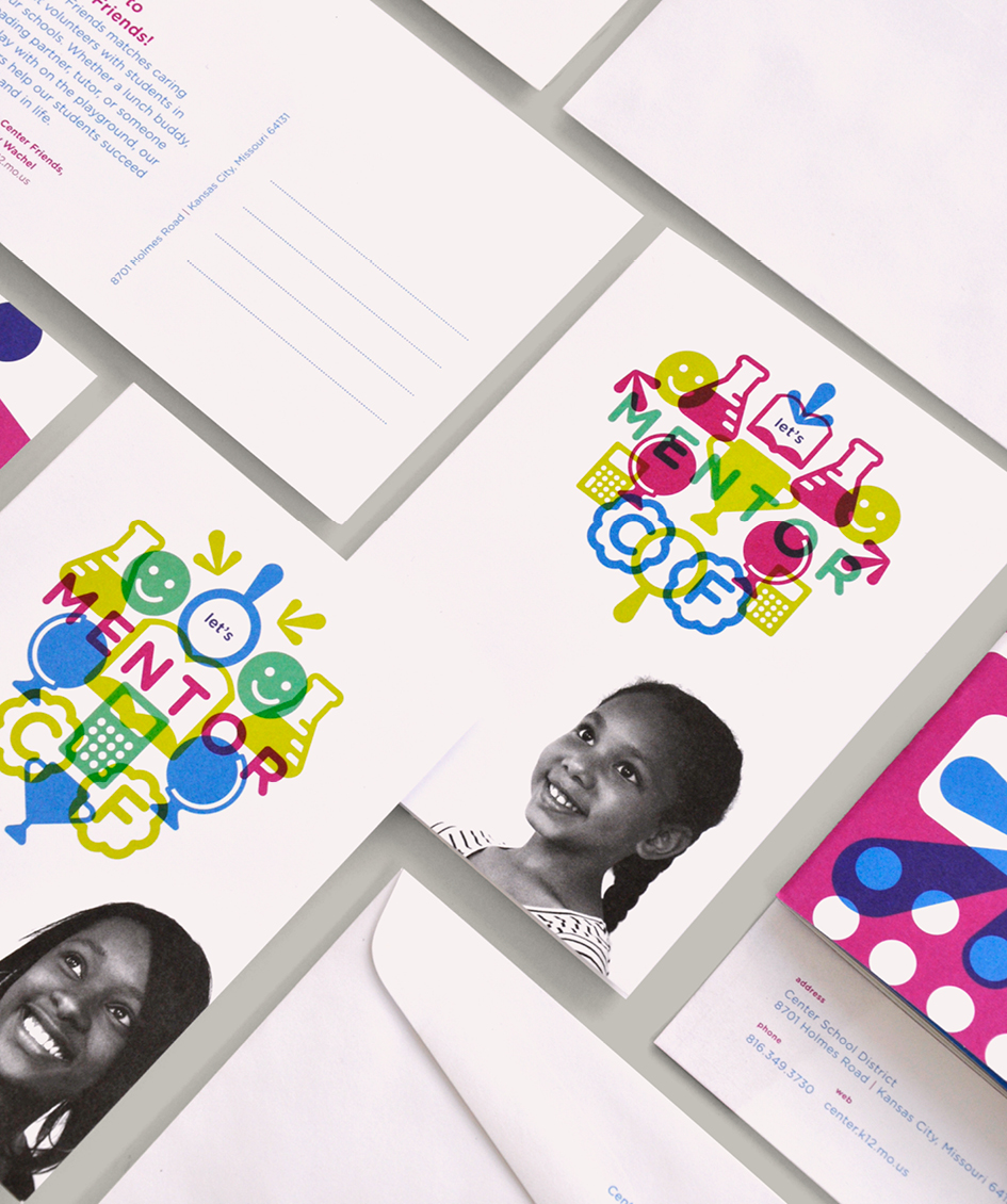
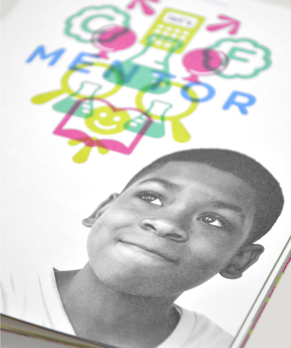
An abstract figure that repeats and overlaps into a circle symbolizes the inclusive nature of Center Friends, emphasizing that not only is everyone invited, but all are encouraged to participate. The imagery visually conveys the program’s openness and suggests the interconnectedness of mentors and students within the mentoring relationship. Using cyan, magenta, yellow, and black as the purest forms of color carries profound symbolism. As the foundational elements of all colors, the palette symbolizes the core principles and values of Center Friends, serving as the building blocks for mentor-student connections. Choosing these colors as a medium for magic underscores the idea that mentorship is a magical process of growth and development, leading to positive transformations in the students’ lives. This symbolism adds depth to the brand and reinforces that Center Friends is a place where individuals can unite to create something extraordinary for the greater good of learning and personal growth.